Case Study: Facebook Story Midcards
Facebook Stories are posts that disappear after 24 hours. Story midcards are quick promotions that appear in between them. Think of them as first-party ads. While they’re used for tons of things, most of them focus on showing sharing suggestions from the user’s camera roll.
I’ve been the primary content designer on Facebook Story midcards for the past 3 years, scaling them from an early experiment into one of the largest drivers of sharing on Facebook. By now, I’ve probably worked on more than 50, more than anyone at the company. I also created their content standards, co-authored their design standards, and firmly established myself as the definitive subject matter expert for the product.
This is an early example of a sharing suggestion midcard.
Part 1: Early Days
The initial design focused on functionality and minimizing risk. Our media suggestion tech was very basic, and we worried seeing private photos next to shared stories would alarm users.
Users could make edits directly from the midcard.
Edits were essential, given how basic our suggestions were. Most were just your most recent photo plus a top 40 song.
Content strategy combined benefit-focused headers with body copy that made it clear the photo has not been shared.
The midcard was a success, to the point that an entire team was created to scale it, with me as the sole copywriter.
Other early midcards offered basic recommendations like memories, reshares, and creation entry points.
Part 2: Gold Rush
Product thought adding edits to suggestions would boost sharing. We tried everything from stickers to AI-generated captions. We also created “one-tap” midcards that could be shared with a single tap, but had a clear editing entry point.
Complex add-ons couldn’t be edited from the card itself.
For wilder suggestions, copy emphasized the edits to the photo. By treating it as a demo, we hedged riskier ideas.
Most themes failed, but ideas like one-tap sharing remained. Meanwhile, long approvals and growing inconsistencies showed the need for design standards.
We added the ability to share with one tap, but it required lengthy privacy text.
Product ordered several bold ideas, including adding AI-generated backdrops and captions. I created the prompt for AI captions. It is still in use today on several story midcards.
Part 3: Quality Push
With new leadership, and improved suggestion tech, we took a “back to basics” approach. Users made it clear they didn’t want flash. They just wanted to share quality photos. I began establishing and implementing standards to improve conversion.
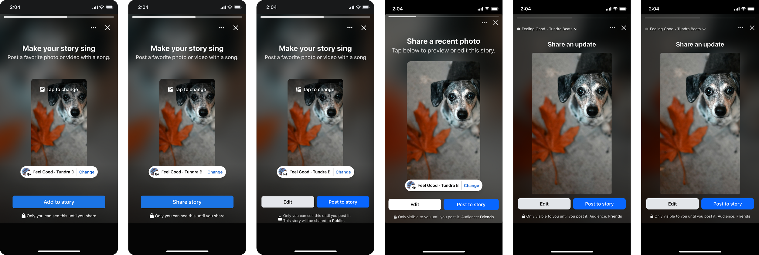
Larger images, with dynamic sizing to fill the screen. Data showed that larger images increased shares.
More direct copy, which emphasized the “what” of the card before getting into the “why” and “how.”
Consolidated privacy strings, from 7+ variants down to 3, all fitting on a single line, even on the smallest devices.
After implementing the design and content standards I co-created, we saw a 17.4% lift in publishing rates.
Direct headlines like this weren’t as impressive, but converted better.
Several new styles of cards emerged during this time, but unlike the flash of the past, we focused on high quality basics.
Part 4: Optimization
Story midcards were now driving roughly 1 out of every 10 stories shared on Facebook. To go further, we focused on new themes, better media selection, and optimized designs.
Used smaller fonts and dropped most subheads, further maximizing image sizes.
Further simplified content approach, adopting a “Share a…” format for most headers.
Toned down music UI, adding focus to the media.
The simplified headlines alone led to a 6.8% conversion lift. The approach was soon adopted across all midcards.
Content became dramatically more straightforward and compact.
Experimentation continued, but with more restraint and consideration.
Part 5: AI and beyond
By 2026, the team was using AI everywhere. Many failed midcard ideas returned, but with better results. For my part, I used AI to run my own A/B tests, ship bug fixes, and build working prototypes.
Used AI to ship quality fixes like outdated privacy copy.
My prompt to generate photo captions with AI returned, and this time it shipped. Making it work is a whole case study.
Ran an A/B test that convinced top Facebook leadership to change a design standard that dates back to the beginning of the app. I proved that side-by-side CTAs perform best when the primary CTA is on the right.
Around this time, my tenure at Facebook came to an end, but I am proud that I scaled what was once a rough experiment into a sophisticated suite of sharing suggestions that now drive roughly 10% of all stories shared on Facebook.
AI-generated backgrounds returned, but this time we left the photo alone. We also added elements like captions, location tags, and more.